

by Aniket Bhushan, with Rachael Calleja
Published: February 23, 2016
This post is part of a series that will summarize our analysis of commonly used measures of development effort. The objectives below are twofold:
- To describe (and challenge) the most widely used measure of donor development effort – the ODA/GNI ratio.
- To compare this measure with an alternative approach which focuses on ODA as a share of the budget or overall budgetary expenditure.
ODA/GNI or foreign aid as a share of donor gross national income
The ODA/GNI ratio is the most commonly referred to measure of development effort. It has a long history going back to the 1960s and 70s (if not earlier) when the concept of foreign aid first took root. The key turning points in codifying the measure, arguably, were, the 1968 UNCTAD conference (N. Delhi) where consensus was reached on the 1% overall flow target between richer and poorer countries (more on this below), and the 1970 UN declaration which made explicit reference to rich countries ‘exerting efforts’ to spend 0.7% of GNI as aid in poorer countries (for more, see references and discussion on aid targets here).
The figure below shows the long-term trend – since 1960, which is the start of the data series – for this ratio for major donors, as well as the DAC country average. Anytime a donor is at or above the target, the line is blue, when below, it is orange.
Figure 1. Major donors long-term ODA/GNI ratios
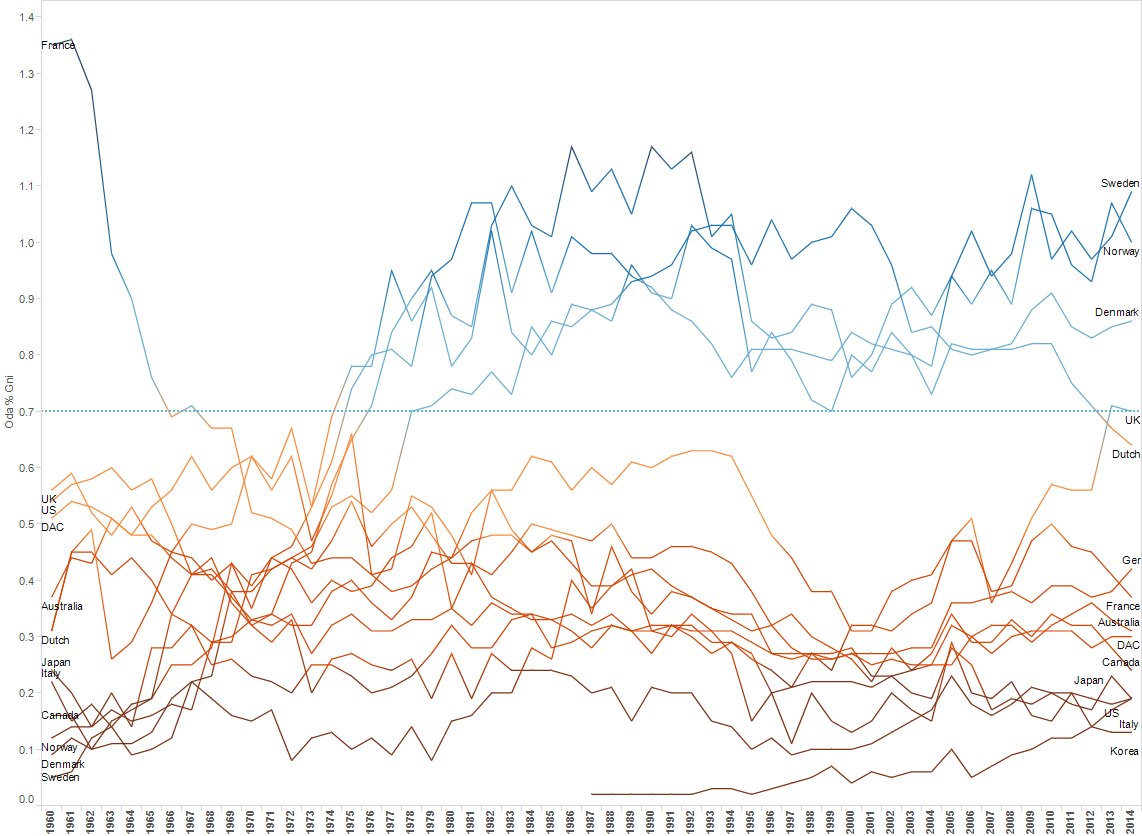
As is obvious above, most donors have never met the target, and the DAC average (both weighted and unweighted) is consistently well below the target.
Nevertheless, for 5 decades, the ODA/GNI ratio and the 0.7 target have been the predominant way of framing and measuring development efforts.
This target and thinking was revived in the Millennium Development Goals (MDGs) and enshrined in the Monterrey Consensus on financing for development (2002) which accompanied the MDGs. More recently it is specifically mentioned in both the Addis Ababa Action Agenda (July 2015) and the newly adopted Global Goals (September 2015).
The target and approach are made even more relevant by the fact that some donors such as the UK have enshrined it into law recently, and others (such as France and the EU) have laid out long term plans to reach the goal.
Challenges and problems
Given the above, what could possibly be wrong with the measure? Below are some of the more serious problems and challenges:
The model that forms the basis of this thinking is largely discredited: the “two-gap model”, which argued that the main constraint limiting developing countries from ‘take-off’ was the lack of savings (and hard currency), has been discredited. It assumptions – all aid would turn into productive investment, all investment would drive growth without frictions etc., and that the lack of hard currency savings is indeed the binding constraint – fail to hold in the real world.
Questionable orientation: it is worth remembering that the model, which forms the basis of measuring development efforts, takes as its starting point rich world income, rather than say poor country need.
Static share of rich countries income makes no sense: neither the two-gap model nor proponents since have ever really clarified why we should expect needs in developing countries to remain at a level that is an unchanging proportion of rich countries income? In other words 0.7 remains 0.7 in good times and bad, whether one part of the equation (rich) is doing as well, better or worse than the other (poor)?
Financial flow conditions are very different today (at least at the aggregate level): the two-gap model thinking goes back to the 1960s. Recall from above that the initial discussion, and consensus, that was reached among rich donors, was that at least 1% of their income (GNI) in total should go towards developing countries. This might have made sense in the 1960s when total flows were about 0.6 to 0.8% of rich world GNI, and two thirds of that was aid. Closer to the present (2010-14 average for instance) total flows are over 1% of rich world GNI. And this does not include the largest flow, remittances. Counting that in, total flows between rich and developing countries are well above the 1% level and hover around 1.5 to 1.6% of rich world GNI. More importantly, aid only makes up 15% of total flows. Private investment (FDI and portfolio) make up over 35%. This does not mean aid is not essential. In fact the contrary. This aggregate picture masks considerable variation. Countries that are not able to attract those other types of market based and other official flows face a dual problem. Competition for global investment is greater as many more developing countries have become ‘investable’. And competition for aid is greater because the demands on aid money are greater, aid allocation has become stricter and compared to the 1960s and 70s donors are proportionately less generous.
Not only have financial flow conditions changed but what counts in the numerator has changed and continues to change: the 0.7 thinking has remained constant but what counts as aid has changed and continues to change. For instance, in-donor refugee costs now make up nearly 5% of foreign aid. This spending takes place inside donor countries and yet is entirely within the definition of what counts as aid. This was not the case before the 1980s. The numerator has only changed in one direction – what can be counted as aid only expands. While it varies across donors, roughly only about half of bilateral foreign aid is ‘country programmable’ or the share that actually ends up in developing countries.
Lobbying tool that is turned into something more than a lobbying tool: 0.7 and the ODA/GNI ratio were originally merely lobbying tools to build support for international development and provide public opinion something simple to rally around. Lobbying is thought of as something that happens from the outside (civil society lobbies donors to commit to 0.7 for instance). What is rarely appreciated is the amount of lobbying that happens within government i.e. across competing bureaucracies, interests and priorities. Rediscovering 0.7, at least in some donor countries that recently committed to the target, is in part motivated by the goal of ring-fencing aid from internal lobbying. But it can have the opposite effect as other departments jostle for space especially when the aid agency (e.g. UK-DFID) is highly reputed (globally) and powerful. Advocates rarely appreciate that non-dynamic targets can work in both directions, i.e. not just increasing aid but reducing aid as was the case in Denmark recently.
The biggest challenge is that the type of thinking 0.7 connotes makes the development sector and development advocates look out of touch with reality and antiquated. At best they ossify existing support, at worst they hinder building new constituencies. It is damning after all for a sector that has evolved considerably in practice we have not managed to come up with anything better as a measure of development effort. (For more on the above, see the ghost of 0.7). New thinking in this area e.g. around the OECD’s modernizing ODA agenda and the total official support for sustainable development or TOSSD takes a similar approach, but adds in additional flows (‘catalytic effect of ODA’, ‘blended finance’, other ‘innovative instruments’).
What needs to change in how we approach measuring development effort?
Of the many things that need to change we focus on two.
First, orientation: the starting point in measuring development effort must change to developing country need, and not donor income. One option which has been suggested (and needs more work) is to start by looking at the cost of provision of essential public services in the poorest countries, and place a floor under the real dollar value of per capita aid that donors commit to providing towards the same. Aid floors are motivated by the idea that “it is worse for a country to be deprived of resources on which it already depends than to not receive additional promised resources”. This would do two things. It would ground targets in a meaningful outcome that strips out the (huge) ‘transaction costs’ involved in aid delivery and focus on the end of the chain so to speak. It would also show that the current level of aid provided in the poorest countries, which by some measures may look praiseworthy, is actually far short of the amount needed to cover the cost of essential services. At a minimum it would help shift the focus away from donor income, to developing country need as the starting point.
The donor side of the equation, especially at a time when support for development is low and fiscal pressures are high, cannot be completely ignored. But even on the donor side we need a better measure of development effort than ODA/GNI and one that is more directly tied to fiscal effort.
ODA as a share of budgets, or budgetary expenditure
ODA as a share of a government’s forward looking budget or (retroactively) as a share of budgetary expenditure is a far better and easier to interpret measure of development effort. After all, arguably the budget is a policy variable in a way that national income is not. The budget is something a government has direct control over, whereas national income (GNI) is an outcome of a number of factors over which government policy has varying degrees of influence.
Measuring development effort in donor countries as a share of donor country budget is a more direct measure of fiscal effort and fiscal commitment to development. It is something people can more easily understand (at least compared to GNI, which is less used, compared to the more common GDP).
What does the picture look like, does it change anything?
First, it is worth pointing out that in our experience at least, this relatively simple change to the analysis proved more complicated than we expected. There are several reason but they boil down to lack of data consistency.
The OECD-DAC is the keeper of aid information and collects aid data from donor countries and publishes the same routinely, including the ODA/GNI ratio. But for whatever reason, it does not provide information on aid as a share of budgets in an equally accessible manner. To circumvent these issues and to conduct the analysis, where possible, along donor fiscal cycles and in donor currencies, we had to go country by country, compiling individual budgets and aid spending. This is the reason why our analysis is limited to the set of countries below. (See discussion of data below).
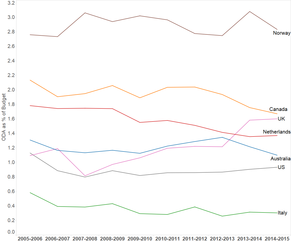
Figures 2 and 3 compare the standard ODA/GNI ratio with ODA as a share of the budget for the same set of countries – Norway, UK, Netherlands, Australia, Canada, US and Italy.
Figure 2. ODA GNI ratio for select countries
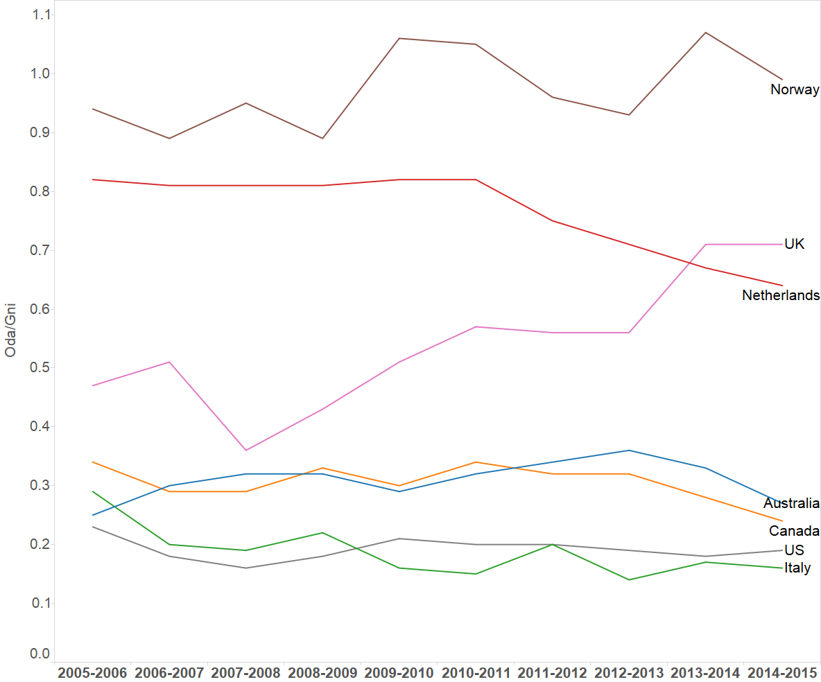
Figure 3. ODA as a share of budget, select countries
Findings
There are some notable changes in the picture if one moves to measure aid as a share of a donor’s budget as opposed to GNI.
- Within this sample only two countries – Norway and the UK – meet the 0.7% GNI target.
- Canada is among the lower performers with its ratio around 0.24% of GNI.
- Norway is the most generous, by far, both as a share of its GNI and as a share of its budget.
- For some countries the picture changes significantly when you look at the latter, i.e. share of the budget.
- The UK has recently reached the 0.7% of GNI target. Canada by this measure provides about a third of what the UK does i.e. is far less generous.
- However, Canada spends a larger share of its budget on foreign aid than the UK.
- How can this be the case? The trends imply the UK’s budgets overall have been growing faster; certainly compared to Canada’s at least since 2009-10, and compared to the rate of change in UK national income (GNI). Its aid spending has been growing at an even faster rate.
- Another factor that can make a significant difference, but is not straightforward to account for, is the difference in fiscal structures. While the UK is a ‘unitary’ state, Canada is highly federal. Which means UK spending is much more centralized (center accounting for 70 – 75% of total), compared to Canadian which is highly devolved (center only accounting for 25 to 27%). The starting point in other words from which the ODA/budget ratio draws, is inherently bigger in a unitary system like the UK compared to a federalized system like Canada.
- Controlling for the above difference in fiscal structure, in a more apples to apples comparison or ODA as a share of only central government budgets, the UK’s ratio would increase to just around 2.1%, slightly higher than Canada (1.7%), in the latest year comparable data are available (2014). But the point holds – that the gap as a share of available fiscal space (budget or public expenditure) is narrower than the gaps as a share of national income.
- Controlling for this however is made complicated by the fact that there are differences within federalized fiscal systems. For e.g. Australia is a federal system, but the center accounts for 60% of expenditure, much higher than Canada. Again, correcting for this, Australia’s ratio would also increase to around 1.8%, making it similar to Canada’s.
- Canada’s ODA/budget ratio is higher even compared to the Netherlands, which fares better than Canada if instead the ODA/GNI ratio is used, and like Canada has been cutting aid spending.
- The direction of travel for Canada’s trend however is downward while it is the opposite in the case of the UK.
- Canada’s performance on these ratios is a byproduct of a set of factors – GNI has been growing slowly (flat, even declining in nominal terms in recent years), overall budgets are smaller and slower growing, recent declines in aid levels have been steep even when compared to others that have cut aid budgets (Netherlands, Australia).
- Ultimately these ratios are a function of the overall level of government spending as a share of the economy. Here it is worth noting that overall government spending in Canada at around 40% of GDP tends to be lower than in countries like the Netherlands, Norway and UK which range around 45 to 50% of GDP. So the bigger pool, of which aid spending is a subset, is systematically smaller in the case of Canada, lower also compared to the OECD weighted and unweighted average.
Canada’s upcoming budget
The ODA/GNI ratio and the logic of the 0.7% target have lost credence within official circles in Canada.
Canada’s federal budget will be tabled on March 22, 2016 (the government’s main estimates are released earlier). We have low expectations generally speaking when it comes to international development and aid spending.
That said, if any reference is made to development spending, for instance using the aid as a share of the budget measure, how should observers interpret this, what should they watch for?
- Explicit quantitative targets: while we do not expect any explicit quantitative targets to be set, if this is not the case, it may be worth keeping in mind that historically Canada has provided about 2% of its budget to foreign aid (the US by comparison spends around 1%). In recent years with the budget cuts this ratio has fallen below 2% and is around 1.65%.
- Reference to trends, averages: if an allusion is made to keeping aid at least at current budget levels, this could be interpreted as modest/low ambition – certainly compared to the rhetoric of Canada being back on the global stage. Remember, current levels are the product of years of cuts. A return to the average of recent years – at least 2% – would be more ambitious.
- Watch the denominator: the more interesting indicator is the overall budget. According to our analysis Canada’s budget since 2009-10 has remained in a very tight range – between CAD$ 270 billion and CAD$ 280 billion (approx.). The substantial deficit projection already announced (CAD$ 18 billion) will have a material impact, but the size of the anticipated fiscal stimulus and if and by how much it increases the budget will be of keen interest. Only in this scenario would any allusion to keeping aid at current levels potentially yield an increase in aid, thanks to growth in the denominator.
- Watch inflation and growth assumptions: at times references to future aid levels are framed in terms of increases in line with inflation or growth. It is worth keeping in view that inflation remains negligible and growth expectations have already been ratcheted down. Therefore to say aid flows will increase to keep pace with inflation may not mean much at all.
Description of data used to compile ODA/budget ratio (MS Word)
Budget_ODA Oct 25 (MS Excel)
This post was updated on March 10, 2016. For questions or comments contact the corresponding author at: aniket.bhusan@carleton.ca
The ODA/National Budget ratio is dependent largely on two factors – the % of GDP spent by government in each country and the % of total government expenditure spent by the national government (as opposed to the states, provinces, municipalities).
Isn’t the relatively favourable ODA/National budget ratio for Canada simply due to these factors, especially the latter and isn’t this the fundamental weakness of an ODA/National Budget indicator?
[…] n’a été pris en vue d’augmenter le financement existant. Encore aujourd’hui, la majorité des pays de l’OCDE, dont le Canada, sont loin de la cible reconnue internationalement de 0,7 % du revenu national […]